EDCI 337 2022 Summer

Category: Multimedia Learning (Page 1 of 2)

Assignment 4: Stress Relievers

Stress is something everyone experiences and struggles with. We understand how difficult it can be to cope with stress, especially when you feel alone. Therefore, we have put together three methods of stress relievers that you could use. Keep reading for more information on stress relievers such as meditation and ASMR.

After learning and interacting with the materials, students should be able to:

  • Have a broad understanding of introduced stress relief methods
  • Describe the basics of meditation, guided imagery and ASMR videos
  • Know how to meditate with their body
  • Know the step to do guided imagery
  • List examples of ASMR tingles
  • Explain how to utilize the de-stress methods and how may they bring relief

Meditation ā€“ Meaghan Leong

Meditation is a great way to relieve stress which focuses on our breathing, mind, body position, sensory skills, and time.

LEARNING OUTCOMES

After this subtopic you will be able to:

  • explain what meditation does and why it is beneficial
  • demonstrate how to meditate
  • list the 7 main components of meditation
  • lead a meditation session for the class
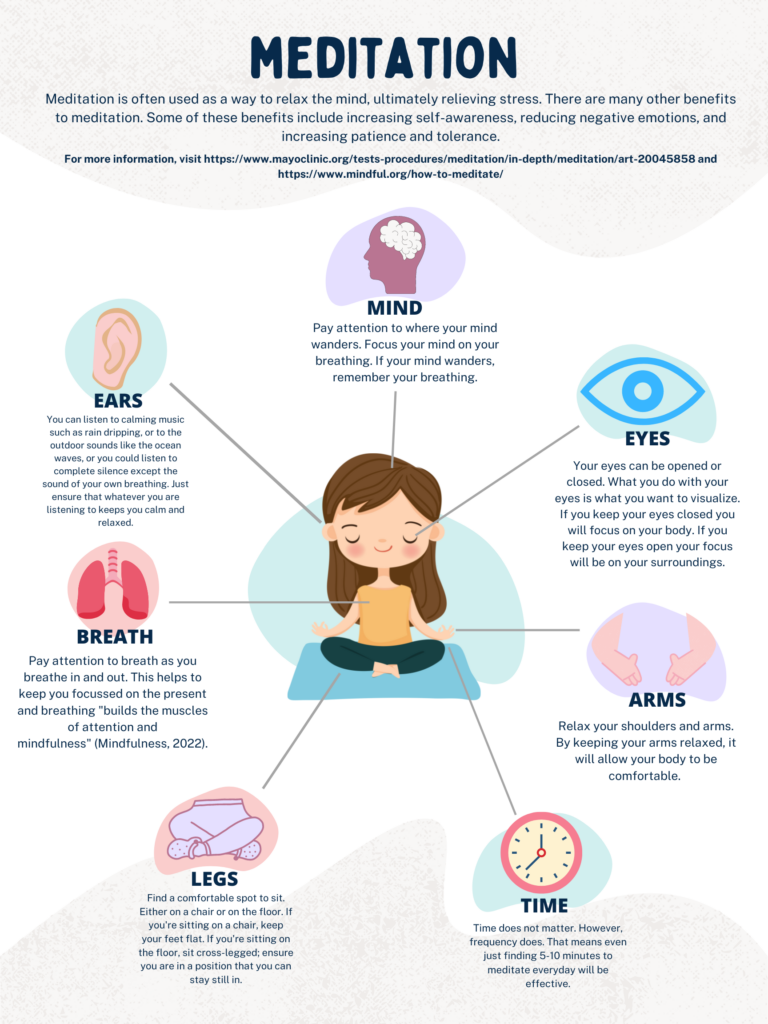
Meditation Canva poster designed by Meaghan Leong (2022)

Implementing Multimedia Learning Theories

I chose to use a Canva poster to represent the physical aspect of relieving stress, in specific, to teach meditation. My poster follows the Personalization Principle, in which I used first person language to catch the attention of my learners. I also followed the Redundancy Principle by recognizing that less is more. Therefore, although I have both images and text, my images only help a learner to comprehend which part of the body I am explaining. As well, I included the Coherence Principle, in which only two choices of media is selected (text and images). My text is all near each image that represents the information and they are all placed in the same way. For example, for each section, first I display the image, then the subtitle of the section (i.e., Arms), then the text which describes that subtopic. By following these principles, my student might be able to learn better and will find my poster easier to follow. An important design aspect I included followed Adobeā€™s 8 Principles of Design. One of the most important design aspects I included was ā€œcolourā€. I thought this was most important because meditation often represents a calm mind. Therefore, I chose light pastel colours throughout my poster that would help set the mood for my learner while reading the information provided.

I also found a video called Ten-Minute Meditation for Beginners (linked below) that goes really well with my designed poster for those who prefer to follow narration.

Retrieved from https://youtu.be/U9YKY7fdwyg

I included this video Ten-Minute Meditation for Beginners because I think it allows for an inclusive and accessible learning on top of the poster. Not only does this video include the Signaling Principle, in which both narration and visuals are included, but also narrates and explains how to meditate. This is considered inclusive for those who may be blind or cannot read, in which they may listen to the narration of the video. Both the poster and the video together make for a very accessible learning experience. This is because for those who may not have access to the internet or an online device, printed posters could be used. However, for those who do have access, posters and videos can also be posted to an online classroom. Therefore, these learners now have the choice if they prefer visual learning aids or verbal cues when learning to meditate.

Guided Imagery – TimiĀ 

This is the second form of stress relief, it is categorized under the mental form of stress relief. After watching the video below students/teachers should be able to:Ā 

  • Know what guided imagery is.
  • Provide the benefits of using guided imagery
  • How to perform guided imageryĀ 

Implementing multimedia learning theories

For this video, I was able to use the SAMR Learning technique in making this video. The SAMR model is a tool that teachers or instructors to evaluate how they are integrating technology into their instructional system or classroom. Through substitution, augmentation, modification and redefinition. In my process SAMR was used to augment the learning environment. In this model, you have a threshold where you move from using technology to enhance learning or using it to transform learning. Though in this technique I wasnā€™t able to use my video as a transformation technique, I was within the enhancement threshold which is not relatively a bad thing. This is because I was still able to improve the learning experience for the viewer.Ā 

ASMR ā€“ Judy

This is the second stress relief method that is a relatively understudied topic in the field of clinical research, but it speaks to a wide range of audiences. After learning and interacting with the material below, students will be able to:

  • Have a general idea of ASMR and its effects on de-stress
  • Describe three common sensory triggers of ASMR
  • Explain how does it feel to watch ASMR videos and reflect on its de-stress effects (or not)
  • Determine whether the introduced stress relief methods are useful for yourself

Autonomous sensory meridian response (ASMR), is a tingling sensation that usually starts from the scalp and moves down the back. Jennifer Allen helped make this concept viral on the internet with her videos whispering to the audiences. Take a look at Keilesā€™s article about the concept of ASMR and how one may feel experiencing it. 

Check out popular ASMR tingles to see if that works for you (remember to put on your headphones):
https://www.youtube.com/watch?v=zpuL8VMfsCw
https://www.canva.com/design/DAFEONGxnuU/OUXVeyoXcayz16n352u0OA/view?utm_content=DAFEONGxnuU&utm_campaign=designshare&utm_medium=link&utm_source=publishsharelink

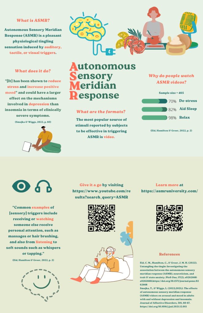
This infographic brochure modified one of the brochure templates on Canva and laid out key points about ASMR. People mainly watch ASMR videos for relaxation, which signifies its function. 

Optional: there is a wide range in terms of the content of ASMR videos, take a moment to dive into some other examples listed below (remember to put on your headphones):

Chocolate chopping

Handwriting

Soap sculpting

Turtle eating food

Implementing multimedia learning theories

I have included both news articles and YouTube videos to help explaining the concept of ASMR, and that brings

The infographic brochure (with two pages merged together) primarily followed the Spatial Contiguity Principle as relevant texts and images are closely put together for audiences to have a better understanding of the content. It has a logical order that helps the audience to grasp the idea of ASMR and then have chances to try and/or learn more from the given links and QR codes, thus, it is interactive. The Segmenting Principle is shown when different parts are divided into questions using eye-catching colours. In addition, while designing this brochure, emphasis is presented when the highlighted keywords are in a contrasting colour against the background colour in order to gain attention and enhance the audienceā€™s memory. To be specific, the theme colour is green and the important information used its contrasting colour on the colour wheel, orange. Last but not least, ā€œwhite spaceā€ is shown so that the viewers will not be overwhelmed. 

Following these will help students from general to specific, learn more about ASMR and have chances to have hands-on/in-person experiences. 

Conclusion

We have included videos, texts, and infographic posters/brochures to facilitate our blog content. It is already a valuable learning experience creating multimedia artifacts, the primary learning outcome we gained after taking this course. These types of multimedia elements can build effective understandings for learners as it provides chances for hands-on experiences. Similar method can be used in other instructive materials (e.g., first aid techniques or magic tricks) enhancing students’ memory.

References

Davis, G. & Norman, M. (2016, July 19). Principles of multimedia learning. Retrieved from: https://ctl.wiley.com/principles-of-multimedia-learning/

Loew, I. (2021, April 28). The 13 principles of design & how to apply them. Retrieved from: https://paperform.co/blog/principles-of-design/#5-proportion

Keiles, J. (2019, April 4). How A.S.M.R. became a sensation. www.nytimes.com. Retrieved from: https://www.nytimes.com/2019/04/04/magazine/how-asmr-videos-became-a-sensation-youtube.html 

Redundancyprinciple. YouTube. (2018, May 31). Retrieved June 22, 2022, from https://youtu.be/_qz9cIaWOhw

The coherence principle. YouTube. (2018, October 30). Retrieved June 22, 2022, from https://youtu.be/PTyr9P15JhI

The signaling principle. YouTube. (2017, October 23). Retrieved June 22, 2022, from https://youtu.be/ENGjwO-kKpc

YouTube. (2018, March 27). Personalization principle dr Richard Mayer. YouTube. Retrieved June 22, 2022, from https://www.youtube.com/watch?v=EYIatC92JhU

8 basic design principles to help you make Awesome Graphics. (n.d.). Retrieved June 6, 2022, from https://www.adobe.com/express/learn/blog/8-basic-design-principles-to-help-you-create-better-graphics

10-minute meditation for Beginners. YouTube. (2020, August 15). Retrieved June 22, 2022, from https://youtu.be/U9YKY7fdwyg
Week 6 – Feedback to Timi’s post

Hey Timi,

You clearly laid out the three models in this week’s material, and I wonder if you have any experience or examples relating to the use of these models? I think these models branched from the three essential parities in education: students, learning materials, and teachers. Echoing last week’s content about backward design, Dr. Bates also highlights the importance of desired learning outcomes as educators select from different media formats for teaching their students. As you said about the SAMR model, it is moving from “using technology to enhance learning or using it to transform learning”.

Last but not least, do you think there is anything in need of update/change for these models?

Week 6 – Video Editing

Updated Week 2 screencast video

I modified my screencast video back in week 2 and edited it with iMovie. Because I have included many pictures with the video, and it is the most effective way to let my audience see how I met the animals as they appeared in my photos, I chose to illustrate my content with a video

The first thing I do is to use the Cognitive Load Theory by reducing the number of objects in each slide since the aim of this video is to let my audience remember the types and animals, and where I met them. A lot of pictures share the same function, so I made my slides shorter and more concise.

In accordance with the Segmenting Principle, I divided my content into four major motifs and presented them with both spoken words and logos I drew. I added a recall page before I finish my video just for my audiences to revise what they have known after watching this video. I added transitions using iMovie to make my different motifs segmented.

With my little arrows pointing to the raccoons and logos that I drew representing animal types, I have made use of the Signaling Principle. I also tried to relate to the Redundancy Principle to keep the format of my content simple and organized as I reduced my textual information and leave out space for spoken narration and photos. I tried to make my video more interactive (the “I” part in SECTIONS) by adding a picture of “mysterious animal” and hopefully it can make my video more memorable.

I like to work with iMovie since it is simple and effective, and I did not go too far since my screencast video is already a slide show with verbal explanations. One thing I have noticed is that it took me quite some time to export my video project, not to mention that my Macbook was frozen during the process of editing my 4-minute video. I think it is mainly the reason of my old laptop, but it is fair to say that electronic devices are the foundation for multimedia teaching and learning.

Week 5 – Feedback to Meaghan’s post

Hi Meaghan,

Thank you for your informative and thoughtful post! Your examples clearly illustrated what it means to provide alternatives and different pathways for students, i.e., different options for assignment formats, or offering necessary technological support for students’ online learning tasks. Your personal experience as a camp leader perfectly shown how to make use of backward design in real pedological conditions, as it is certainly structural and organized. Responding your comment to my post, I do not mean to prioritize the teaching stage over the planning stage, but to say that they work together towards a successful learning experience for the students. One can see if the several sizes of clothing they have provided in their plans fit the students during the actual teaching processes, and use this experience to enhance the future teaching designs.

I enjoy reading your blog and thank you for sharing!

Week 4 – Feedback to Meaghan’s post

Hi Meaghan,

I like the images of beautiful sceneries in Victoria! They are catchy and highlighted by your background colours. I can see that you embedded the designing principle of hierarchy as you order and size the images of tourist attractions in Victoria. I can see that aside from the colour balance, there is balance in your content as the below three are weighing the same space and presented in alignment. I would want to see more textual information on this poster if you are considering updating this one since the space you left on the left-hand side is kind of empty for a poster targeting visitors.

Lastly, thank you for your work!

Week 5 – Design Theories

Photo by Edho Pratama on Unsplash

I think it would be more than important to keep in mind the idea of inclusion at the stage of instructing design, as it may at its best be taken care of in this way. Moore’s video showed that not only the instructor should have the idea of inclusion among the students with disabilities but also the idea of diversity among students’ minds.

An open mind towards the course of teaching and learning as well as the awareness of achieving a goal of teaching are both required when designing the instructive methods. I think what Wiggins highlighted about the idea of backwards design is benefiting both the instructors and students. For instructors, as he mentioned, they will not get lost halfway when students present their ideas and redirect the whole learning experience into a brainstorming activity. For students, their learning outcomes are emphasized. Their desired learning outcome is well-planned, and their working process is noticed with care. Having an expectation and an organized plan is crucial for both parties to achieve the goal without wasting time or energy.

Despite the preparatory planning stage, the actual teaching process itself is definitely important to a successful teaching/learning experience. As Moore noted for the concept of inclusion, we are the ones creating what is being called “history” later on. Stepping forwards and adopting new ideas and methodologies are inevitable for a better teaching/learning environment in the present, and a well-prepared learning design will be more capable of dealing with unexpected or updated incidents.

Assignment 3 – Updated Infographic

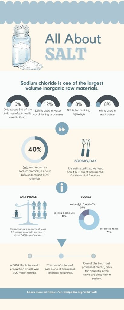
https://www.canva.com/design/DAFCw5J1CfY/USLLucNSms9BESFWIjbIbA/view?utm_content=DAFCw5J1CfY&utm_campaign=designshare&utm_medium=link&utm_source=publishsharelink

I updated the infographic poster I createdĀ last weekĀ customizing one of theĀ templates provided by Canva. I made several changes that I consider would make my poster more effective in delivering my content to viewers.

The “story” told in my poster design begins with descriptive scientific knowledge about salt and its wide range of applications. It progressed to the statistical data documenting salt people eat/consume as the familiar but not-so-well-known knowledge. It ends with extra fun facts about salt, which leads to the final “visit more” section that hopefully can make people curious about salt and actively explore more about the content.

The first thing I changed was my previous colour theme and my font colour. According to design principle #7, blue tends to make people feel calm and trusting, and it fits my content introducing salt, so I stick to a uniform blue theme with light and slightly darker blue to create an overall calming visual effect. In order to strengthen the idea of visual contrast, I changed my font colour to black, as it will look more highlighted and easy to read than before. The title, in particular, is more effective than my first draft since I removed the not-so-functional decorative patterns and increased the size of the title, making it clear and more striking than the previous vague look. 

The second important update is the visual aspect of this infographic. I realized that I was lack of images for creating an infographic poster. Thus, I replaced the percentages with images representing various applications of salt in people’s life. I would think that along my way to good design, I paid attention to aesthetics and making my product understandable. According to multimedia learning theories, people learn better when the knowledge is sourced from more than textual information, and numerical pie charts on their own is not enough when more visual effects are available.

In addition to the images added in the first block, I also put a QR code at the end. I realized that this is a poster, and people may view it under different conditions, and having a QR code would make things easier compared to entering the URL into the search engine. I have had a similar experience where I tried to remember an URL but forgot it – not only that it is not something that sticks to my mind, but also that extra information is neither necessary nor urgent for me to explore. That is how people may let go of a chance of learning when they are only interested in a poster to a certain degree, and I think a QR code can solve this problem perfectly.

Last but not least, I made several little changes to improve my symmetrical balance, making sure that the content in my poster is evenly distributed and comfortable to read.

Week 4 – Feedback to Timi’s Infographic

Hi Timi,

Thank you for your post! I can see that your poster makes use of harmonious colours and hierarchical orders of the recommended spots for coffee at Victoria. I can also see a visual balance between the images and texts that are arranged with a pattern. I would say that one thing that could be more emphasized is the design principle about contrast – I think the information that you aim to highlight could be displayed more prominently. For example, I think bold letters for the most attractive elements of a specific coffee shop or only put out the specialities as key points and reduce the word count in each block could help creating more space. Overall nice poster! It is easy and informative for me as a viewer.

Week 4 – Infographic with Canva

The combination of textual and visual information shown by infographics together creates multiple ways for viewers to understand and process the content, and it is undoubtedly an effective learning tool. Overall, Canva provides me with a great opportunity to organize my content with its templates and resources, particularly when I already have my ideas in mind. I found working with templates really fun and less overwhelming when delivering ideas.
Here is my poster.

Week 3 – Feedback to Meaghan’s Post

Hi Meaghan,

I can see that your post clearly laid out the difference between gamification and game-based learning for me, think you:)

Your experience in designing a board game for the class particularly highlighted the social characteristic of socio-constructivism, as you have to make it accessible for your peer after understanding the learning content and converting it to the gaming language. I can see why it is effective and helpful as it needs a deep understanding for someone to be the player and recognize the correct answers. It shows the interactions within a group in a gaming environment, which is definitely a good example for GBL.

For your example about gamification, I think one of its advantages is the in-time encouragement and rewards for children that could help them focus on what they do. Thus, I would consider which shows certain features of behaviourism as it involves positive/negative reinforcement for their actions.

Thank you for the examples that effectively present the practical use of GBL and gamification in teaching and learning!

« Older posts

© 2025 Judy's Blog

Theme by Anders NorenUp ↑